Client
Fortius clinic
Fortius clinic
The brief
The brief was to create a patient app that had to be multifunctional, would work on all screens (technically creating two different projects - an app for phone users, and a portal website for tablets and desktop computers) and would be easy to use, intuitive for all users. As they had an app previously designed for them, but were not completely happy with the functionality and usage, they wanted some parts of the app to be revised and upgraded. And as the brand was going through a rebrand, it also had to include the new look and feel, the company was projecting offline.
The brief was to create a patient app that had to be multifunctional, would work on all screens (technically creating two different projects - an app for phone users, and a portal website for tablets and desktop computers) and would be easy to use, intuitive for all users. As they had an app previously designed for them, but were not completely happy with the functionality and usage, they wanted some parts of the app to be revised and upgraded. And as the brand was going through a rebrand, it also had to include the new look and feel, the company was projecting offline.
Findings on the current app
After inspecting the app that was in place at the time, I noticed it had limited functionality, only the basic needs were covered, such as a quite simplistic way of booking a new appointment without the options of amending the appointment, or even on the timeline the option of seeing your appointment in greater detail, or paying for the appointment, which was a big problem they were trying
to solve.
Goals
- Provide a way to track the appointments
- Provide a way to track the appointments
- Improve functionality
- Add “notifications” option
- Add option of paying online
- Create a timeline of events for easier tracking
User research
As the target audience was extremely varied, the only thing in common to them all was the fact that they were all patients of the clinic, the user personas that were developed had to really encompass all the different profiles - from the tech savvy younger audience to the users that were not inclined to use technology or apps in their every day life. As there was a previous app, previous user research created and user personas were developed for the existing app, I had taken those findings and upgraded them to create the personas the app should cater to.
As the target audience was extremely varied, the only thing in common to them all was the fact that they were all patients of the clinic, the user personas that were developed had to really encompass all the different profiles - from the tech savvy younger audience to the users that were not inclined to use technology or apps in their every day life. As there was a previous app, previous user research created and user personas were developed for the existing app, I had taken those findings and upgraded them to create the personas the app should cater to.
As the app was supposed to enhance and upgrade the user experience, if not completely substitute the journey, we knew that the option of calling for an appointment still had to be there, but should be slowly phased out, staff trained for this purpose alone - to help the patients get used to the app, by either seeing them in person while at the clinic or by using the helpline that was set up for this purpose.
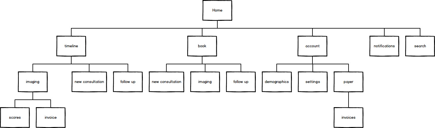
User flow
After sitting down with the team in order to better understand what are their expectations what the functionality of the app should be, the below user journey was devised. It encapsulated all the different aspects of functionality the group wanted and expected from the new app.
After sitting down with the team in order to better understand what are their expectations what the functionality of the app should be, the below user journey was devised. It encapsulated all the different aspects of functionality the group wanted and expected from the new app.
On to the sketching
After the initial research stages and after journey was all mapped out and in front of me, I had a clearer idea how the app should be developed, what screens are needed and - and most importantly what it should look like.
After the initial research stages and after journey was all mapped out and in front of me, I had a clearer idea how the app should be developed, what screens are needed and - and most importantly what it should look like.
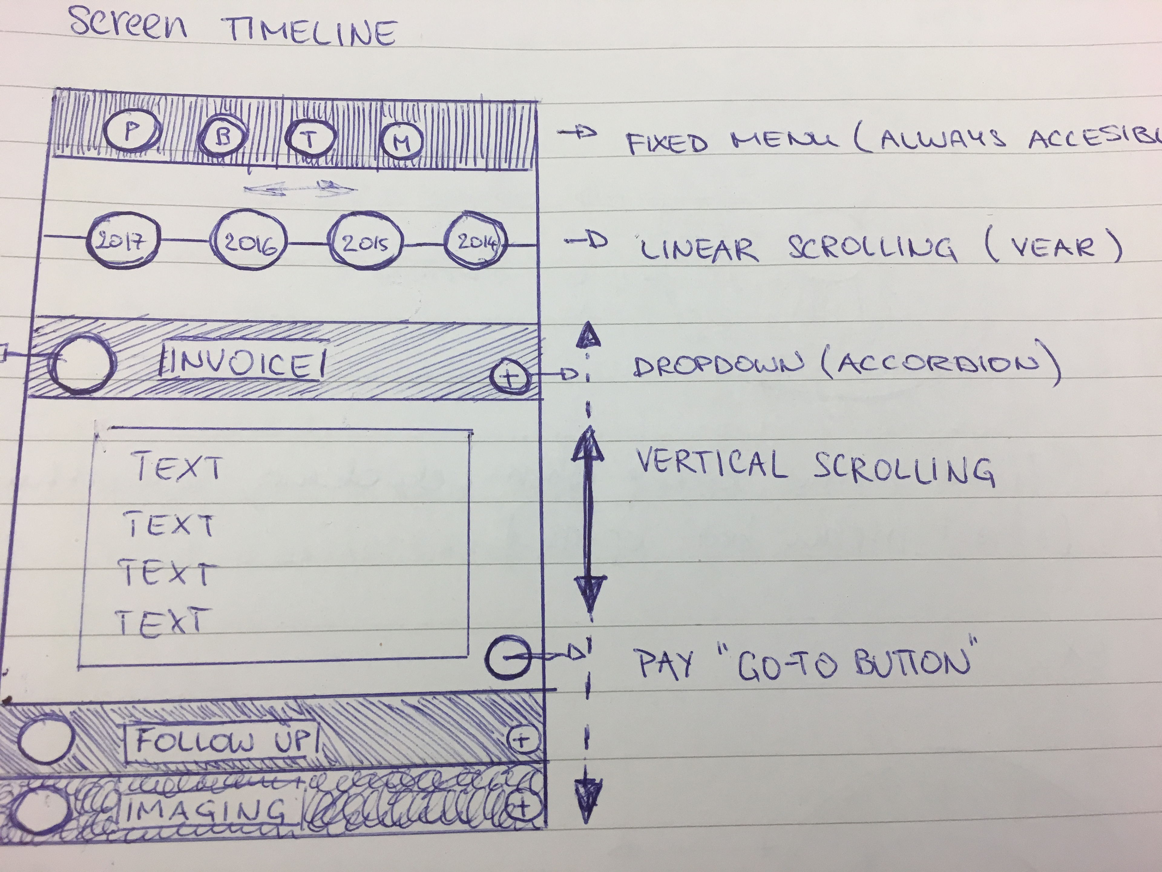
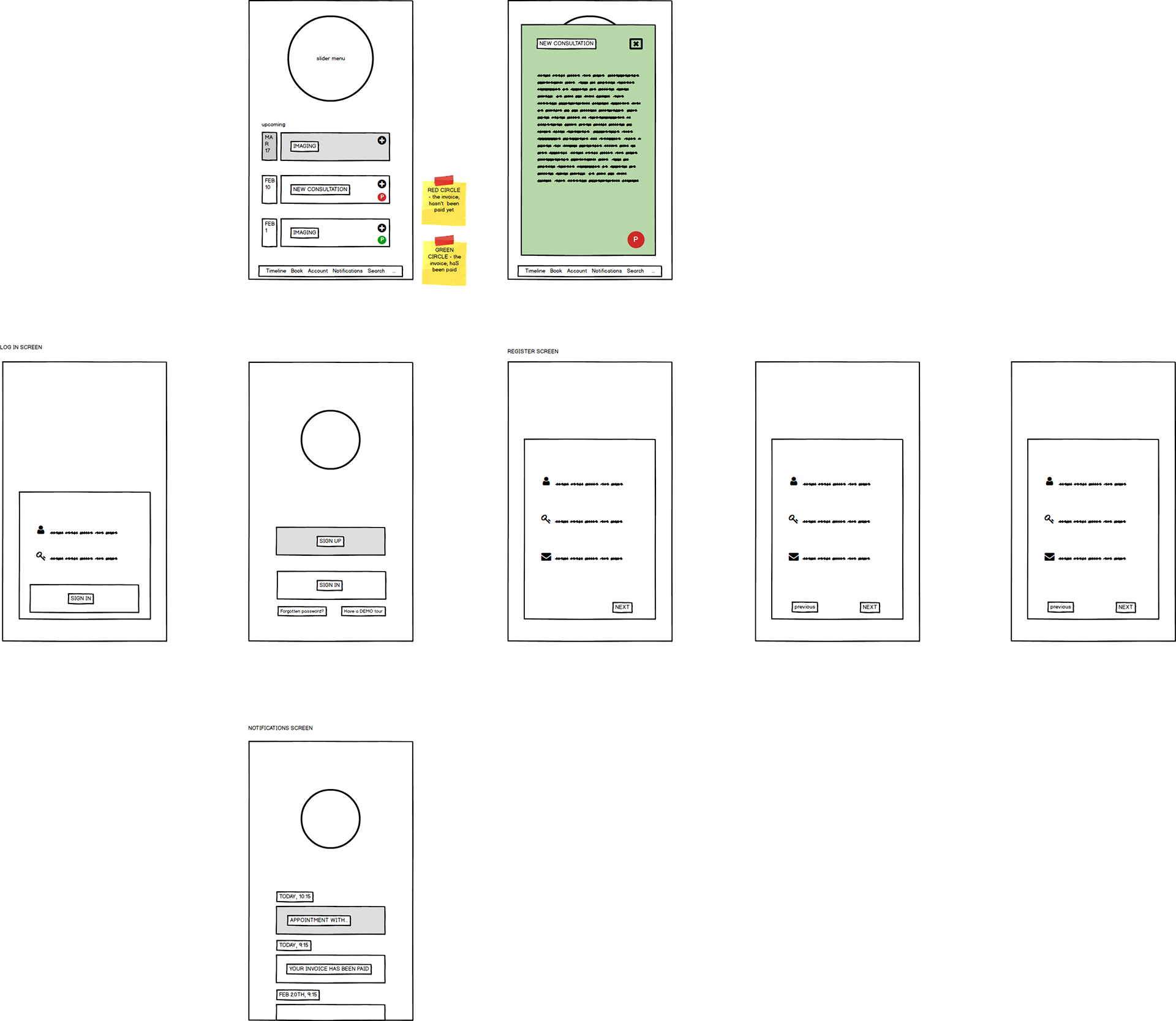


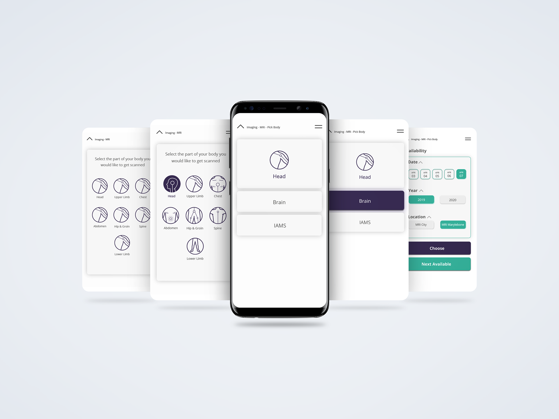
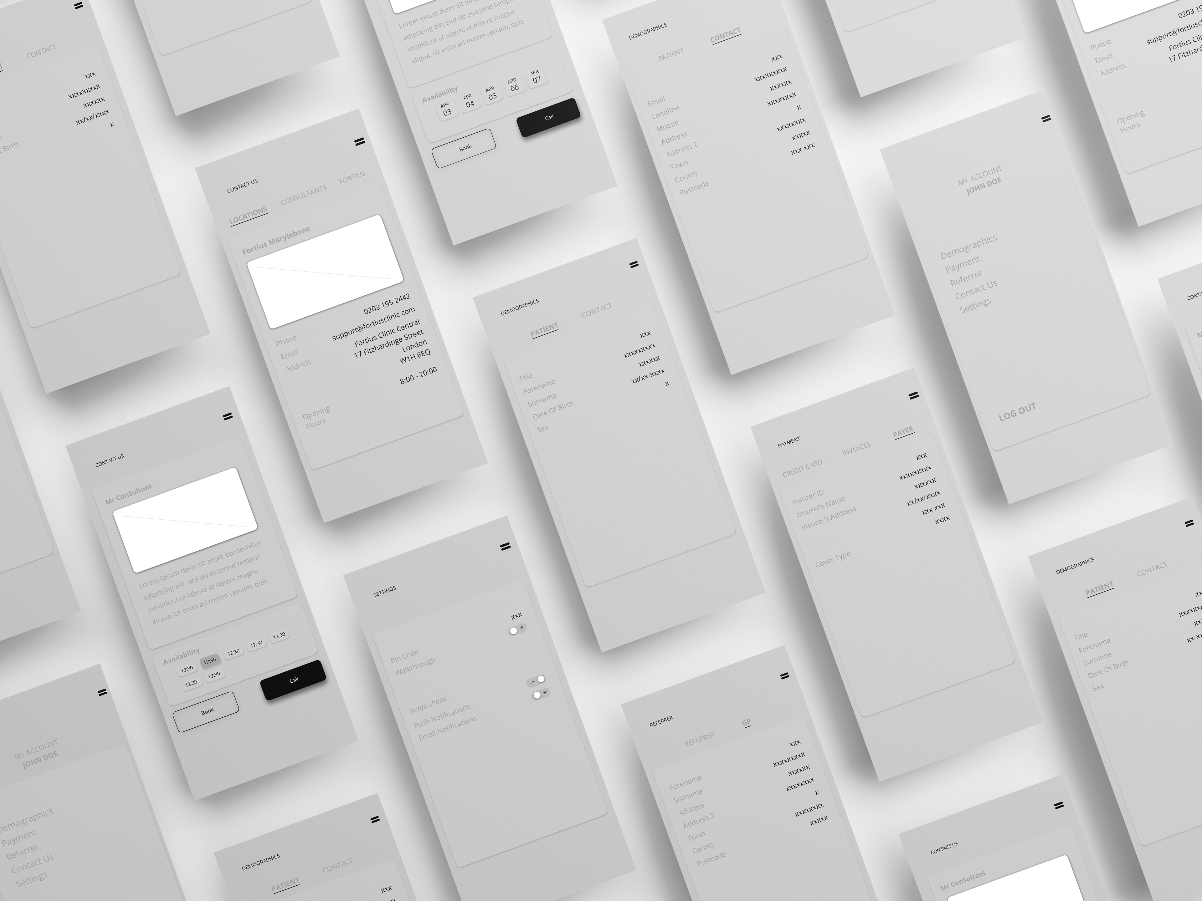
Wireframes
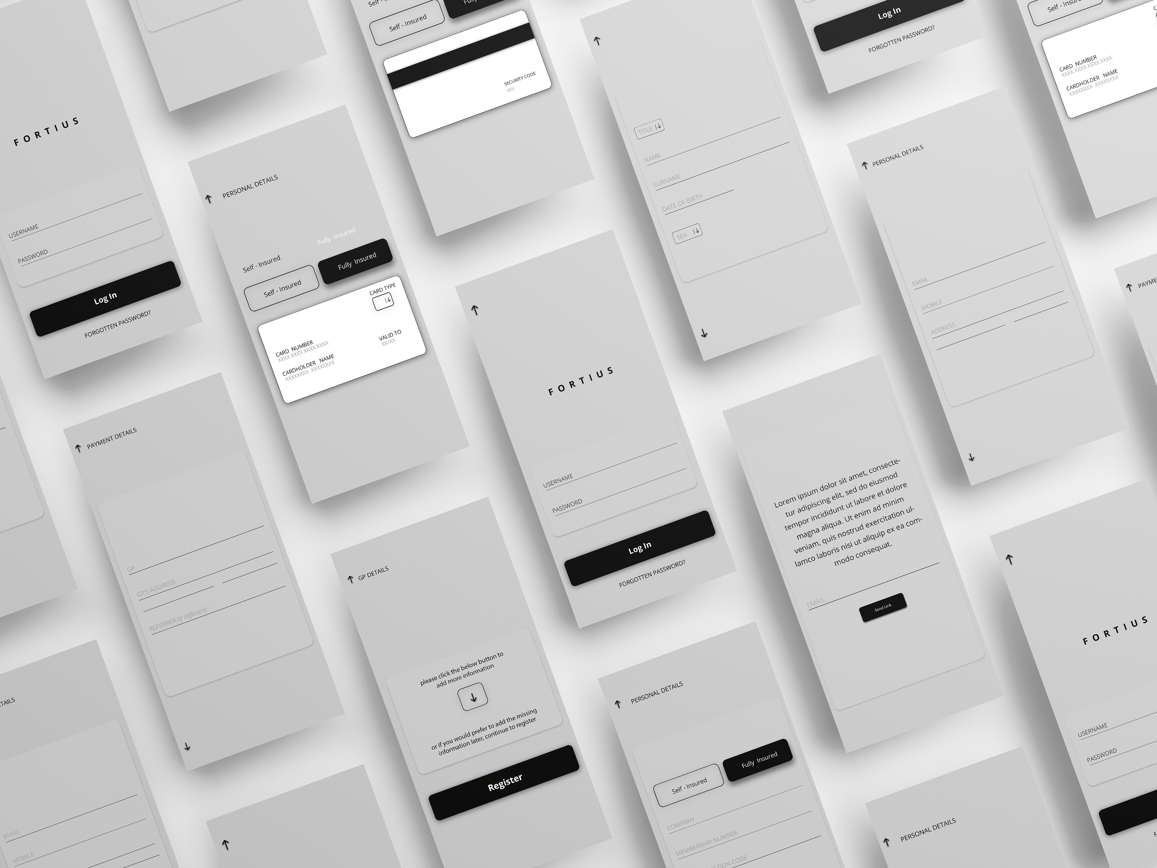

Onboarding & Registration
As the app was meant to substitute the old fashioned way of creating appointments, checking their appointments and paying their medical bills it was up for an option as to how to as easily as possible to transition all patients to start using it - as we were aware of the fact some might have additional troubles or would want to go about phoning to the admissions office to set up a new appointment, the users were all ask to register as a way to easily keep their records on a system.
As the app was meant to substitute the old fashioned way of creating appointments, checking their appointments and paying their medical bills it was up for an option as to how to as easily as possible to transition all patients to start using it - as we were aware of the fact some might have additional troubles or would want to go about phoning to the admissions office to set up a new appointment, the users were all ask to register as a way to easily keep their records on a system.
The onboarding is quite simple in the way it shows the options the user has when navigating through the app. The predominant colour of onboarding is Fortius’ signature purple, and they were keen to feature the colour in some way.
As the registration was not possible without actually being a patient and obtaining registration details from the clinic, as the nature of the details and the data is extremely confidential two way ID system was devised in order there would not be any breaches - this is something that the preliminary testing had to get absolutely correct and all the iterations had to be spot on.
As Fortius was going through a rebrand where I assisted as the lead designer, the colours were chosen based on the preliminary conversations with the marketing team and directors in order to establish the colours they feel comfortable with and the colours they think that represents the brand. The colours featured in the app were the new colours that were chosen for the main brand as well.
Testing
After the first draft of the app was created, we needed to test if the app does indeed support all the functions that we set out to create. In V1 of testing the staff and the consultants were the first to get acquainted with the app if it fits to their standard. The results were satisfactory as apart from some naming issues that the marketing department deemed incorrect, there were no bigger concerns in terms of the app functionality, intuitiveness and simplicity of understanding.
After the first draft of the app was created, we needed to test if the app does indeed support all the functions that we set out to create. In V1 of testing the staff and the consultants were the first to get acquainted with the app if it fits to their standard. The results were satisfactory as apart from some naming issues that the marketing department deemed incorrect, there were no bigger concerns in terms of the app functionality, intuitiveness and simplicity of understanding.
In V2 the app went through more rigorous testing, this time with the patients, as there were no massive concerns or a lack of usability, the app was ready to go live and help the patients go about their appointments easier.
The final design can be found here